


Market Reports
Wheelhouse
6 weeks
- Ian—Engineering
- Mike—Eng. Lead
- Andreas—Data Science
- Product management
- Design
- Front-end development
- React
- High charts
- Chakra UI
- React query
- Reach UI
Wheelhouse provides demand-driven pricing for short-term rentals. To do so, it utilizes immense amounts of market data. Customers had long requested access to this data, and had been using other products to get it. When we finally decided to create a market report product, we identified a number of additional problems it could help solve.
problems.
Increase automated nights
Automation was our #1 source of revenue. Through hundreds of conversations with users, there was a certain percentage who needed additional data before turning automation on.
New revenue stream
Covid sped up the need for additional revenue streams. There were companies selling monthly subscriptions for the same market information we were using internally.
Broaden customer base
We knew there were other user groups we could bring into Wheelhouse with new offerings. One for example, were people looking to get into the short-term rental business.
Disseminate market data
We knew there were other user groups we could bring into Wheelhouse with new offerings. One for example, were people looking to get into the short-term rental business.
Increase conversion rates
We found visitors to Wheelhouse were looking for proof points. One way we did this was via our recommended pricing. With market reports in addition, we could have two different options to showcase.
background.
Why market reports are important
They are important for a number of reasons. One, for instance, is validity. For revenue managers, the ability to compare your pricing strategies against a number of areas is important. Competitive sets provided a one to one comparison. Market reports provided the forest for the trees. With them, managers could better understand market trends, which events to key in on, and where to grow.
Industry solutions
Our team spent time previously (and did so again) reviewing what other services provided. Our head of support, Vu, had many conversations with our users. Quinn, our product manager spoke extensively with companies and our internal revenue managers about competitive sets and how they are used to create pricing strategies.
Short-term rental software
- See Transparent
- Beyond pricing
- AirDNA
Hotel-grade software
- Duetto
- Star Reports
Where these fell short
- Context switching: A service like See Transparent offered the information to learn about a market, but to actually set prices you needed another product.
- Key data sectors and time periods: Paired with the static data, users were often frustrated with the limited data provided and had to make educated guesses.For instance, most services offered aggregate performance information but left out helpful nightly pricing breakdowns.
- Cost: Services providing market reports cost significantly more than our target price.
Our existing (internal) solutions
Internally, we were using a third-party service, Mode, to dynamically create reports of baseline market data. Our team could view these reports within Mode, Slack, or send them to an email. Our team was utilizing this for our own brand, Lyric.
Externally, our support team generated PDF's and distribute to users who requested them. Generating these PDF's took considerable time. More often than not, users often requested more data, different charts, etc.
Focus areas
Based on our conversations with our internal revenue managers, existing users, and from the research we performed we knew there were specific areas we could create a lot of value.
- Defaults, yet customizable: This was especially true for graphs.
- All the data: Make all the data we collect available, including hotels
- Historical & future metrics
- Forecasting
- Gated product: We wanted to provide a free market to explore along with a baseline of data for each market.
Goals
- Create a new revenue stream
- Increase in automated nights
- Broaden Wheelhouse's customer base
- Provide a better solution that the competition, or at least on par at the initial release
- Re-use existing system
I spent the first few days talking with our internal team and reviewing previous documentation on the subject. We already had a few competitive audits providing helpful info. I spent some time researching the companies we missed, along with taking screen shots and noting specific features which stood out.
Vu got to work creating an interview document and scheduling the users over the initial couple weeks.
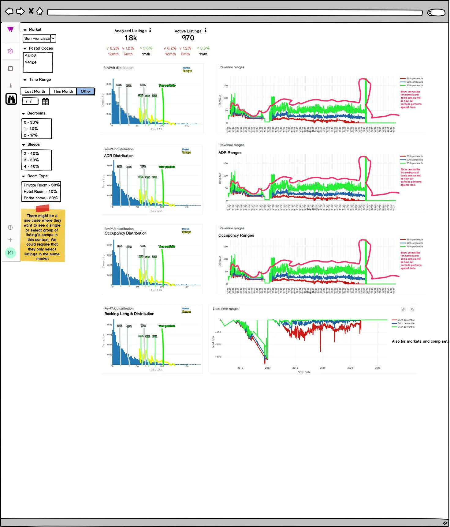
Mike started reviewing the existing code to see what we could utilize. He also spent time research different graphing libraries in hopes there was one we could plug and play with. We discussed the different graphs we knew users wanted, along with the ease of customization. We broke these graphing libraries into a few different tiers at which point Mike started testing them.
While doing this Mike also put together a loose wireframe to show how he was thinking about the product. To hit the ground running we agreed on the direction and he started to wire it up.
early constraints.
During the first two weeks we made a couple product decisions to provide some rails to work against. We had this time boxed and couldn't go more than a week over.
- Pre-defined postal code regions: Basis for the markets, allowing us to provide easier searching & more-reliable data sets
- Basic filtering: Stick to a few key attributes based on the cached JSON files
- More opinionated: Define the exact charts & metrics we would show in the first release instead of allowing customization by the end-user.
- Basic comparisons: Utilize percentiles to provide a comparison for users with listings in the market
- Limit features: To get this out to beta users for testing, we had to limit the feature set.
scope.
Marketing
- New marketing pages (main page & one for each market)
- Demo interface
- Email announcements
- Intercom messaging
On-boarding
- Dashboard notification UI
- Introduction video(s)
- Free-trial offer
- Sign-in / create account
- Subscription UI
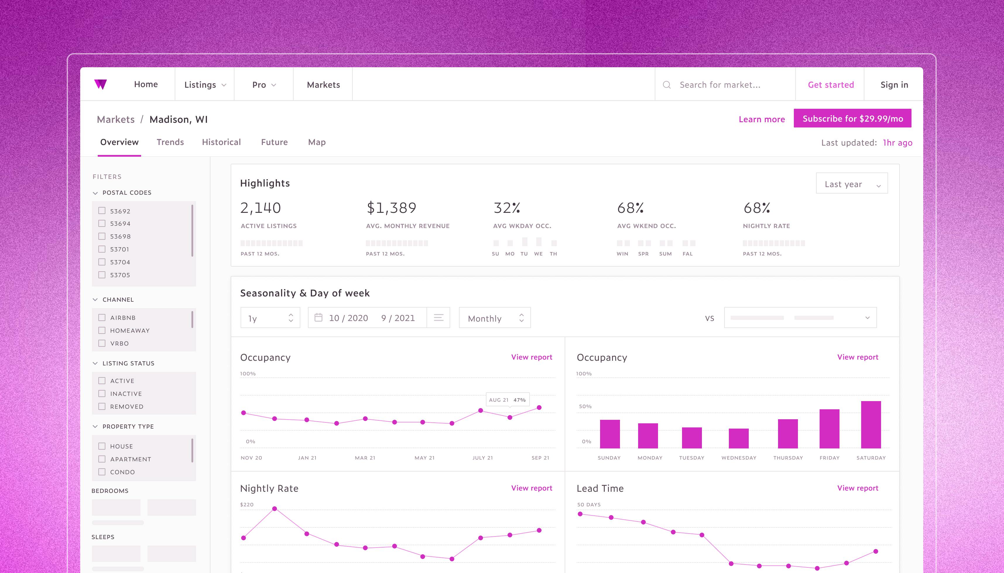
Overview
- Status (free-trial, subscription, updates)
- Subscribed markets
- Potential markets
- Special offers
Specific market
- View UIs: Dashboard, historical, future, trends
- Chart types, components, data requirements
- Filter types & UI
- API configuration for each view
- Map configuration
Payment
- Configuring Stripe
- Add payment method UI
- Update account UI
Support
- Help center articles
- Video walkthrough training
- Support staff ramp-on
Misc.
- Update database tables for new subscription type
- Market data caching & optimization


Over the first couple of weeks Mike and Andreas had time to review the Wheelhouse data. Based on availability and how it was configured within our backend would help guide our discussion for what metrics & charts were possible given the short timeframe.
- Market grade
- Counts—listings, hotels
- Listing breakdowns
- Occupancy
- Avg. Daily Revenue
- Revenue per available room
- Revenue
- Booking lead times
- Avg. stay length
- Avg. rate of booked | unbooked nights
- Annualized revenue ranges
Potential graphs & tables
- Initially, focus on most widely expected—ADR, Occupancy, Revenue, RevPar, Demand
- Utilize line charts, percentile breakdowns, and comparisons
By the fourth week we had made good progress. We understood what data was available and had some APIs wired up. We had configured a set of functions (as hooks) to correctly format the incoming data, including structuring for the active filters. We had stubbed out a few charts (including theming) to show the team. And we confirmed a few different views for the initial release. These were the dashboard, historical, future, and trends.
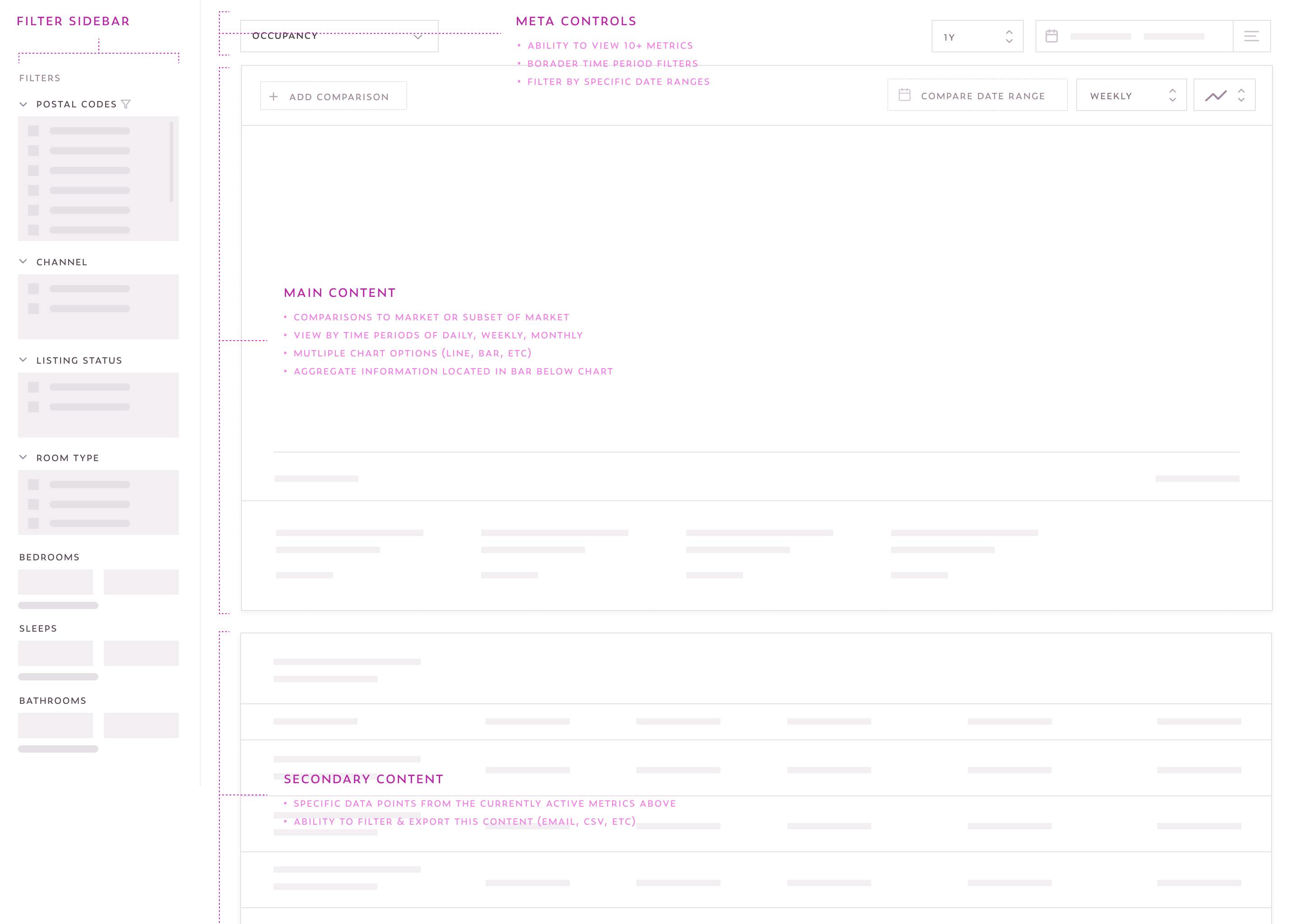
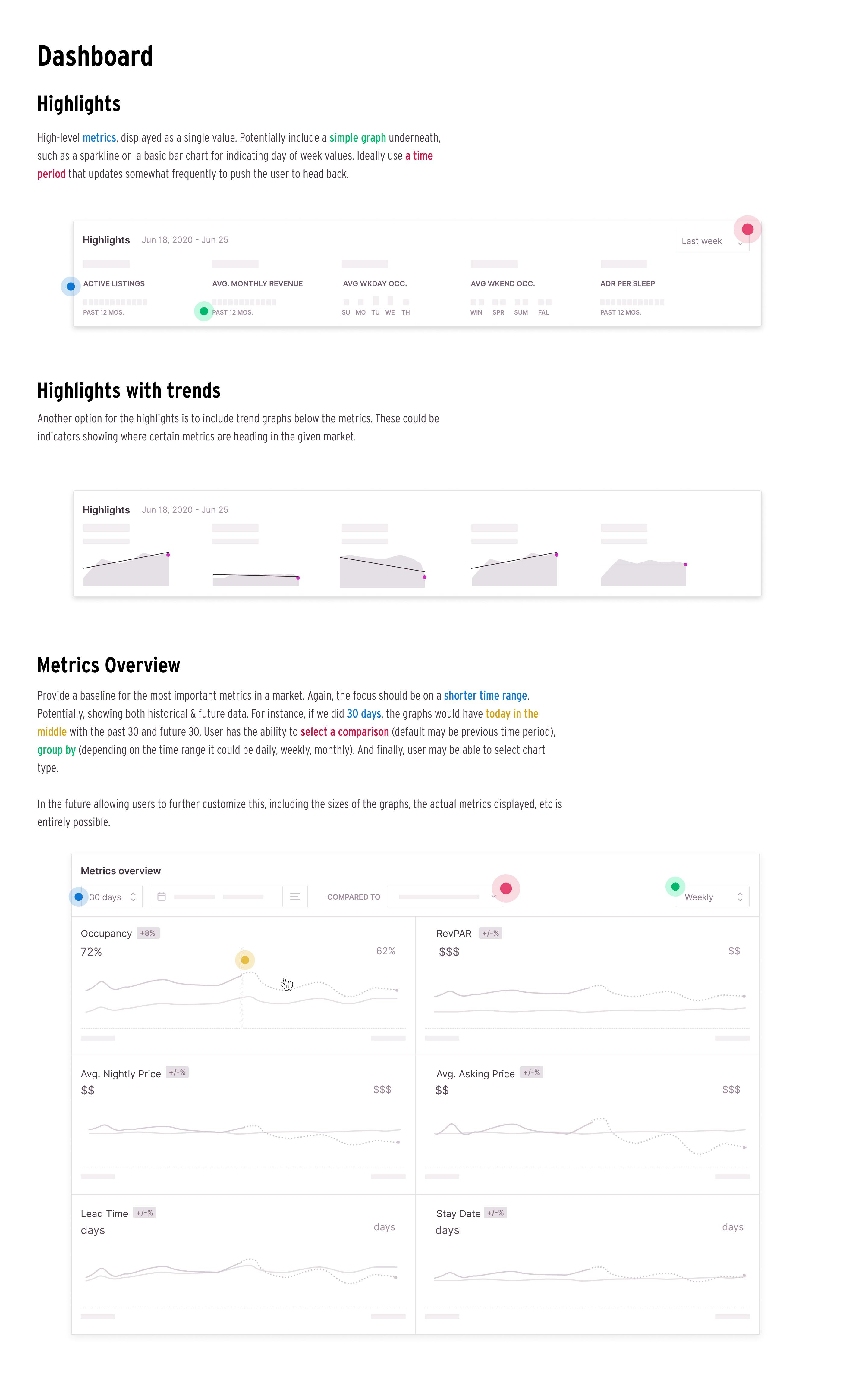
I wanted to make sure we understood the role of the dashboard and the other views. I spent some time writing up a few documents highlighting the differences. The following is a small segment of that.
A dashboard should provide a high-level overview that informs the viewer instantly about the state of the market. It should also provide access to the additional information that’s needed to respond, but that journey extends beyond the dashboard itself.
Some ways we can do this include:
- Quick & easy comparions (time period, target value, specific postal code)
- Provide trend lines. For instance, within the highlights card, if we can display a sparkline that also has a trend line imposed on it to highlight the direction the metric is heading in the future.
- Provide both historical and future data in the metrics overview graphs given the chosen time range selected (wecould default to like 30 or 60 days)
Ideally we limit the number of metrics & graphs here. We need to determine the most important graphs to show, but in letting the user gain valuable info about the market, and also ones that update frequently enough to push the user back often enough.


In 6 weeks we were able to get a functioning prototype ready for beta testing. In doing so, we were able to get constant feedback from the internal real estate team, along with select users. We accomplished the most important focus areas, allowing us to focus on the next steps focused on marketing the product to the general public and releasing.
Here is a demo of the status nearing the end of the 6-week project.
next steps.
Release to public
Complete remaining tasks
- Finish new marketing pages
- Email announcements
- Wheelhouse app dashboard notification
- Configure map view within the market UI
- Create release process for help content (videos, articles, etc)
Explore additional features
- More hotel data
- Specific event data
- More export options
- Additional filters
- Ability to choose between faster zipped JSON files or dynamic data