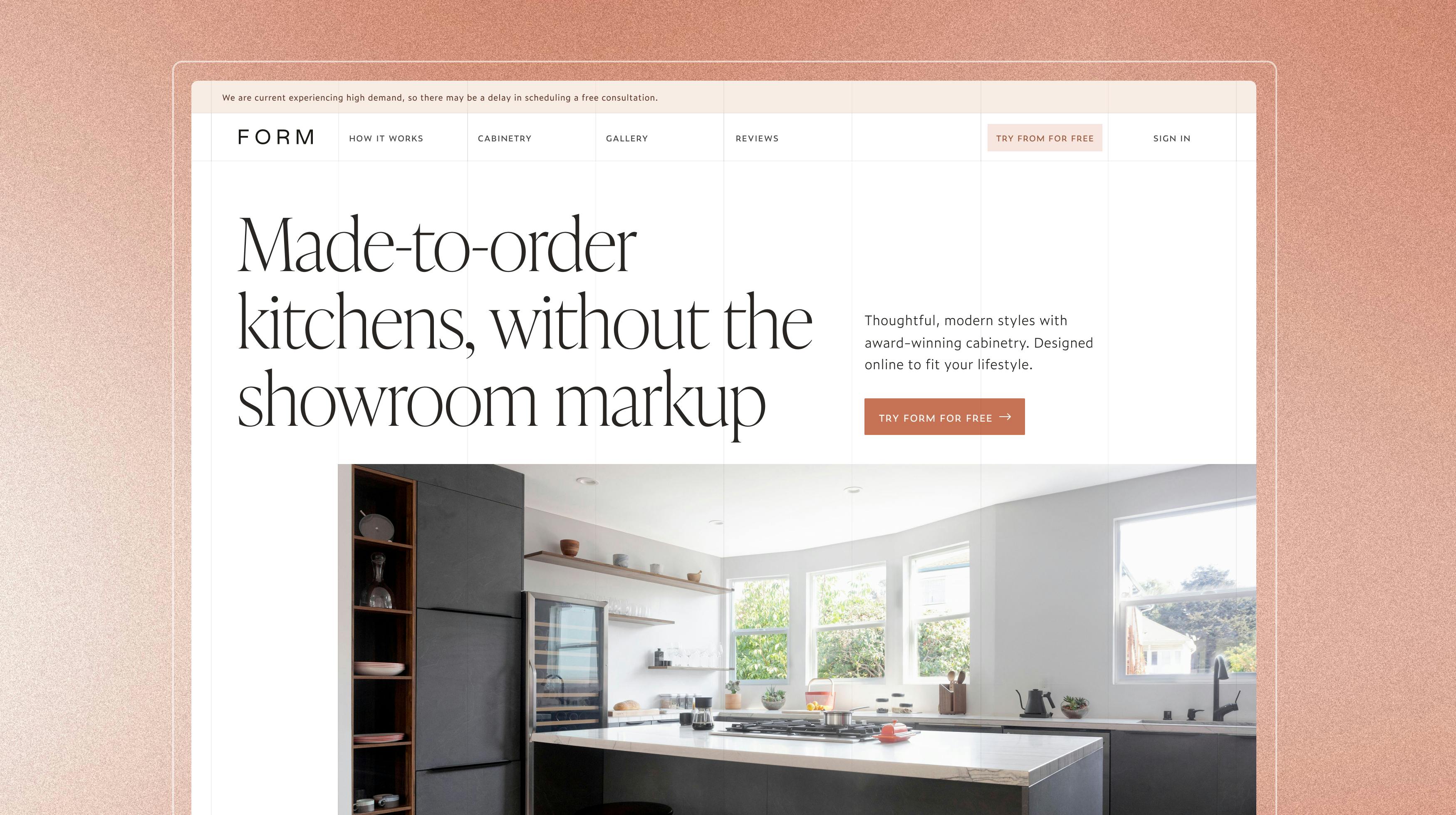
Marketing Site
FORM Kitchens
- Strategy
- Copy
- Design
- Development
- Michael - Co-lead
- Danny - CEO
14 weeks
- Updated brand identity
- New marketing site
FORM, like a lot of growing startups, was quickly outgrowing their existing marketing website, both in style & copy. To highlight the new experience and differentiate FORM from the competition, I was contracted to help co-lead a site refresh.
Getting started
Process
I was tasked with doing all of the design and development (among other things) for the marketing website & updated brand identity. I was also co-leading this effort with Michael, the Head of Brand and Marketing. However, since he was going to be on paternity leave for a significant amount of time I planned on bringing in other members to help me. This included the co-founders Danny (CEO) and Tom (CTO) along with Mariana, FORM's sole product designer.
The team was small and so everyone was already busy. And so, while I wanted the project to be as collaborative as possible, I knew there were limits. We met more often in the first phase of the project. During the middle we met every Friday as a team to review and then on and off through the rest of the week. In the last phase we met more often, especially so in the last couple weeks.
Better understanding FORM
The first couple weeks were all about understanding FORM. I worked with Michael, head of Brand & Marketing, during most of this phase. In addition, Danny & Tom, the co-founders of FORM, were often involved.
Some of the things I did included:
- Interviewed team members, including the above along with the head of the design team, the kitchen designers and the other product designer on the team, Mariana.
- Participated in the sales training to better understand their process & how marketing materials were being used
- Listened to a number of consultation calls between prospective clients and the FORM account executives
- Listened to a number of kick-off calls, which start the design brief process between a designer and client
- Did a competitive audit with the top 4 brands in the space
- Reviewed previous brand identity work
- Documented everything we were keeping and the areas most in need of updates
Proposals
The next few weeks I proposed a number of directions for the project. I worked with Mariana (FORM product designer) on the branding efforts (incl. but not limited to colors, type, iconography), Michael (Head of Brand & Marketing) on site architecture and copy, and Tom (Co-founder & CTO) on development tooling.
branding
Right from the beginning I focused on keeping the branding flexible. I wanted to limit finalizing as much as I could until we were able to start implementing the designs. An issue FORM had with the previous branding work was the gap between the final identity and how to best utilize it across their marketing efforts. And so, my method involved weekly meetings where I proposed identity work alongside the marketing pages.
site architecture & copy
Danny & Tom expressed wanted to keep the site architecture the same through this revamp. The desire was based on their learnings over the past couple of years and hundreds of conversations with prospective clients. And so, as I started reviewing and setting up my files, I kept that in mind. I did propose a few different ways of approaching the marketing site.
development tooling
I spent time learning what tooling was being used, both for the marketing website and the application. I wanted the marketing pages to be easy to change, both in structure and styles. After talking with Tom we decided to stick with Gatsby for the frontend framework and Contentful as the CMS. I proposed separating the styles of the marketing site and the app. I suggested Tailwind CSS for a number of reason: its wide adoption, ease of use for new engineers, it was completely customizable, and it was composable.
A year prior FORM hired a design agency to create a new identity and website. Unfortunately, the agency delivered a brand that the internal team had a difficult time implementing. And so, they made a number of trade-offs throughout the process, ending up with a look they felt didn't represent the brand. That being said, there were a few items they wanted to keep, such as the logotype and icon.
In addition to the logo staying the same, Michael, the head of brand & marketing, had recently finished an updated mission statement, set of values and overall voice.

Design
Branding updates
Knowing the time, effort and money put into the last branding project, I wanted to de-risk mine as much as I could. So I pushed for a more flexible approach. Instead of creating a finalized identity and then doing the marketing pages, I would do both in tandem, in hopes that some of the identity would grow out of the website.
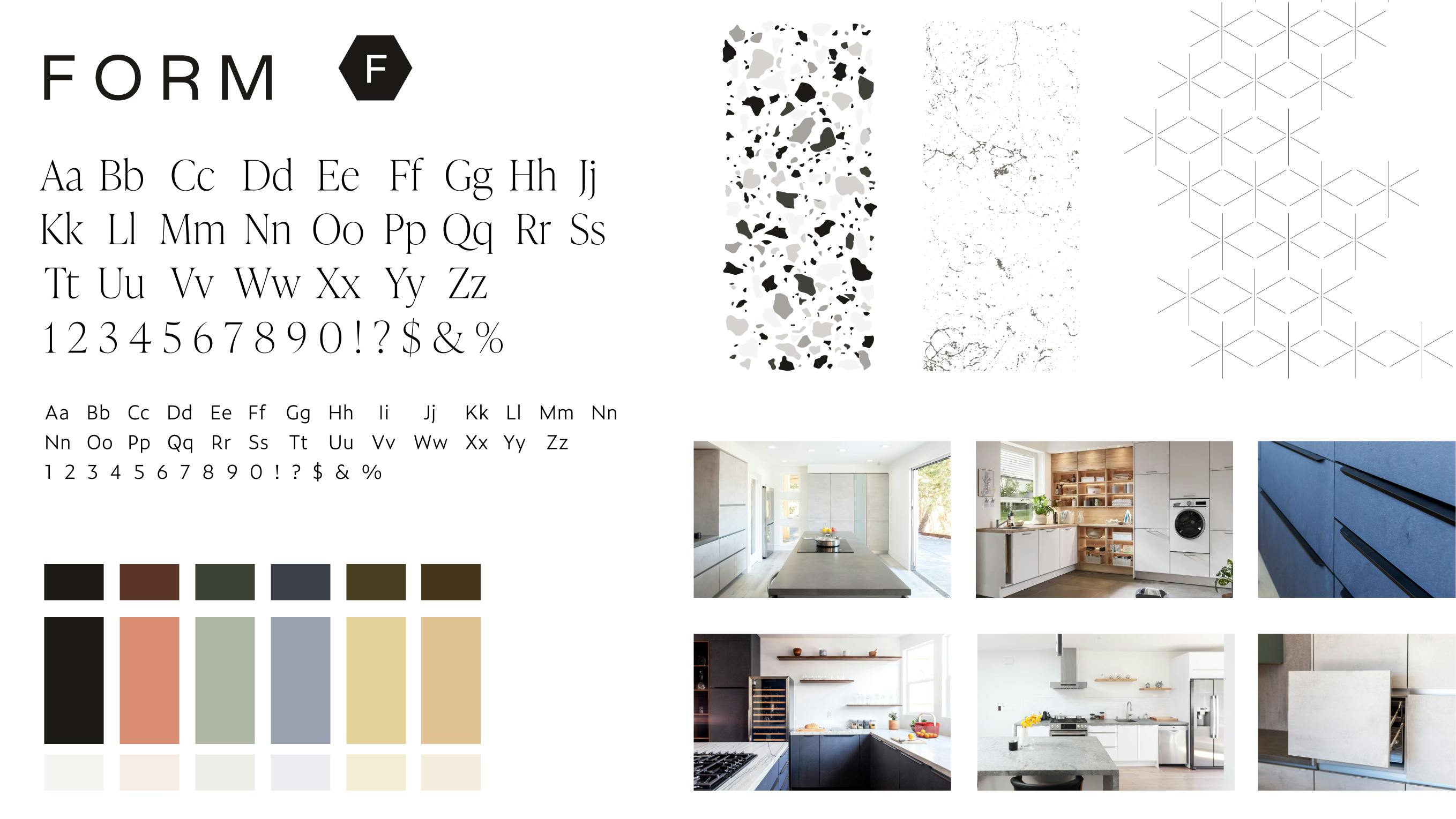
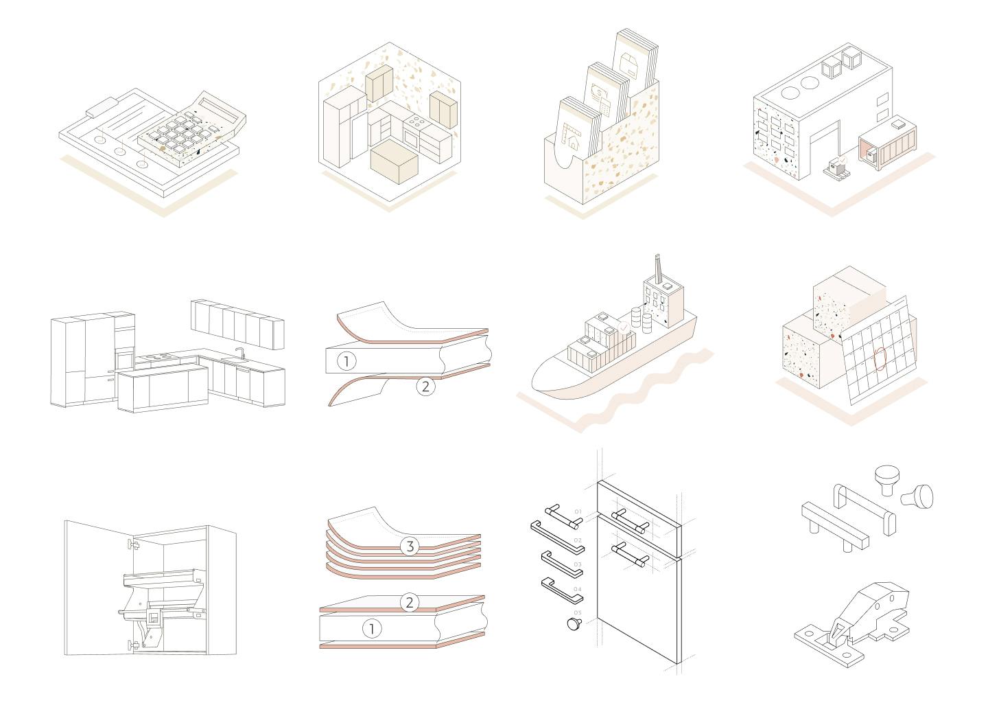
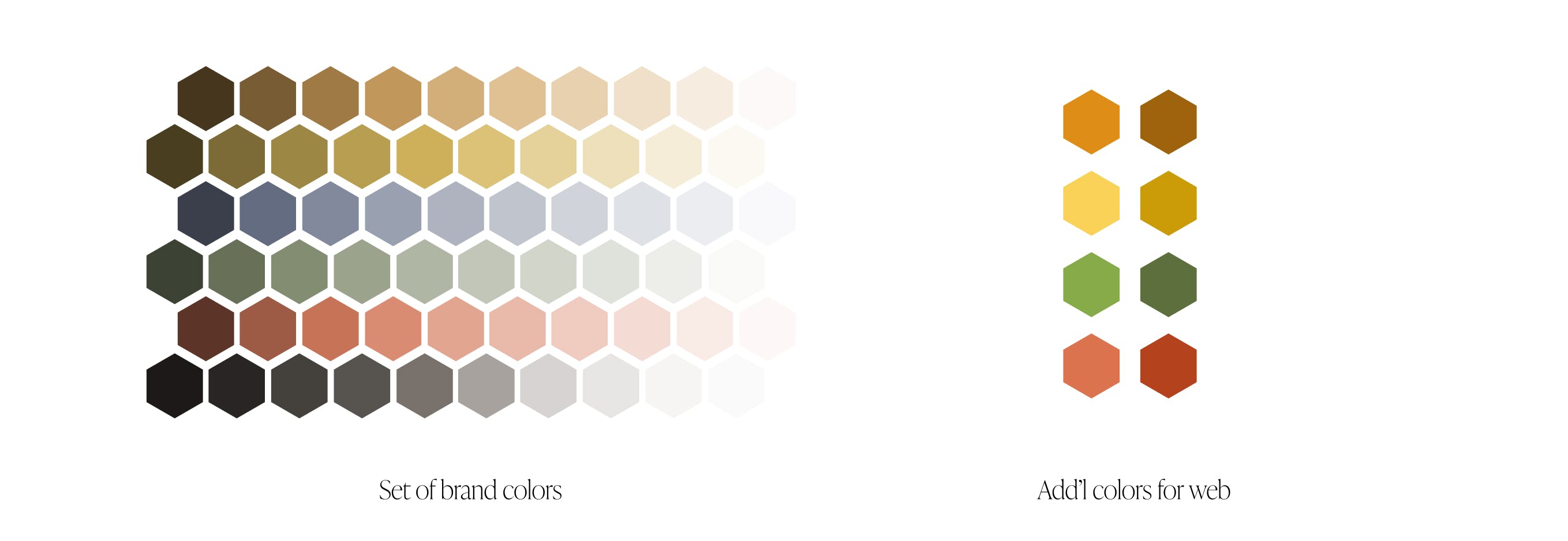
There were a number of areas in the identity I was tasked with including: colors, typography, iconography, grid systems, textures & patterns, and photography style.
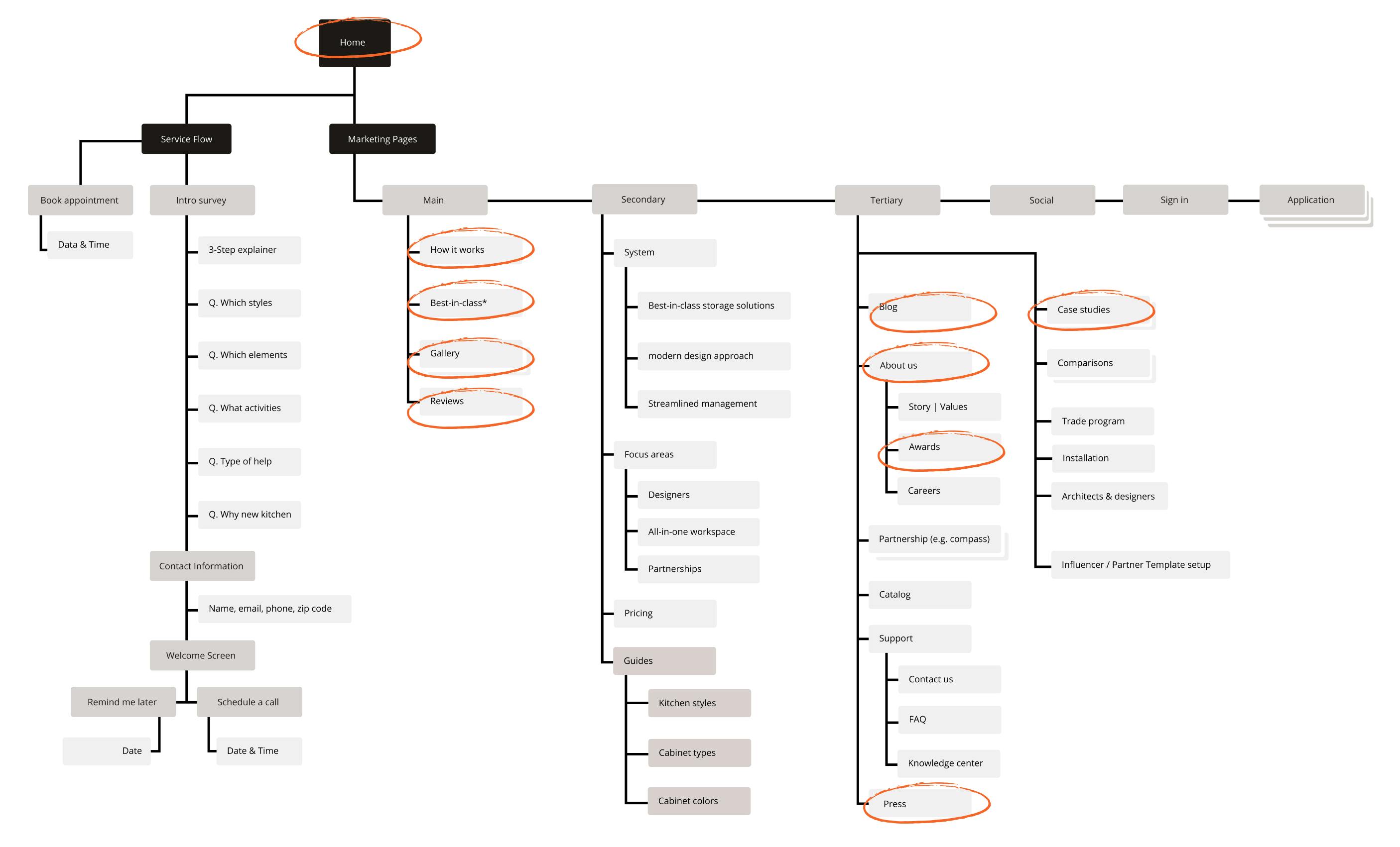
An area I worked on early was the overall site structure. Utilizing the existing sitemap, I explored adding pages focusing on specific aspects of FORM that set the company apart. This was a new type of offering, and I felt the condensed approach FORM was taking hurt the overall brand, story & consultations the account executives were having with potential clients.
I created an updated sitemap and spent some time exploring what these new pages could look like. I did my best to keep the overall UI & copy lightweight enough to give the leadership team an idea of the direction without having to spend too much of my time. We had a few conversations and they felt these new pages could be impactful. However, with the small team, time constraints, and Michael being out on paternity leave, they wanted to keep the scope slimmed down. And so we stuck with the pages circled in red.
Designing the pages
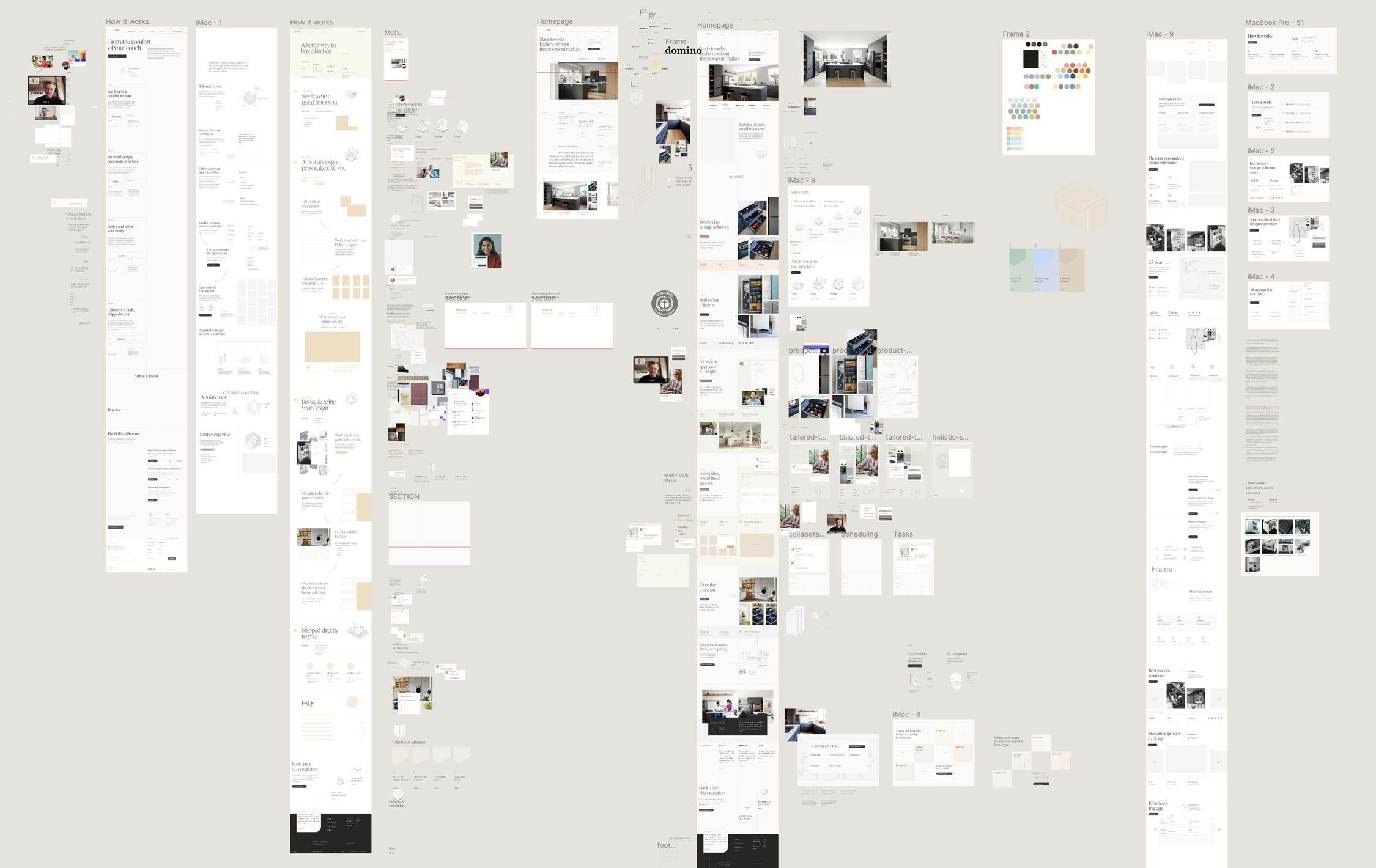
I took a number of approaches with the design in the beginning. And as noted above, worked with the overall brand identity within each approach.
One involved wire framing out most of the pages. I then applied the grid and started loosely laying out the sections with temporary content. This gave the team a sense of the overall direction.
Another similar effort involved loose mocks of marketing assets like emails, ads and social media constructs.
Another approach I employed was focusing on the homepage. I broke out each potential section and started proposing different layout & type structures. These were a step more specific where I could start finding general patterns I could apply to the whole site. As these developed I started adding colors, illustrations and imagery. If something didn't feel right we'd take a step back and try another way. Again, I wanted to keep this process flexible as I was working mostly with the founders.
Each Friday we met as a team and I spent an hour walking everyone through the work I did during the week. I also reviewed the previous week to provide the right context for why I was doing what I was. Based on these meetings we'd consider next steps. At the beginning these steps were very loose but as the project progressed we'd focus on specific site sections.
In the end we created the following pages:
- Homepage
- How it works
- Cabinetry
- Latest projects
- Reviews
- Guarantees
- FAQ
- Blog
- Individual case studies
- Installation guide
- About
We also updated the initial on-boarding along with an instant estimator guide.
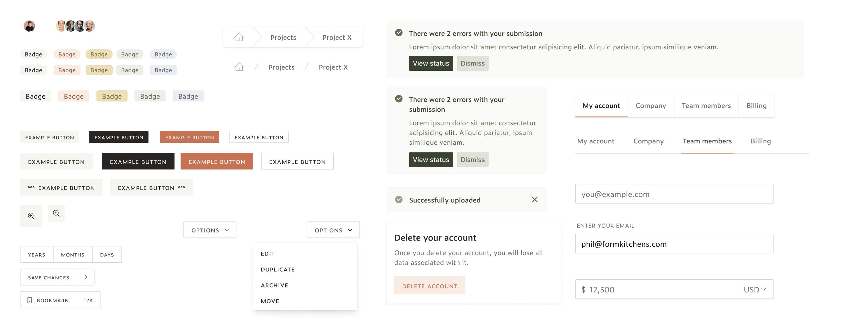
As I continued making progress on the marketing pages, some stylistic patterns started to emerge. Seeing UI elements like buttons, badges, and inputs in multiple areas gave me the opportunity to make some visual design decisions. Within Figma and the code I started setting up variables for things like type scale, border radius, colors and spacing.
Homepage
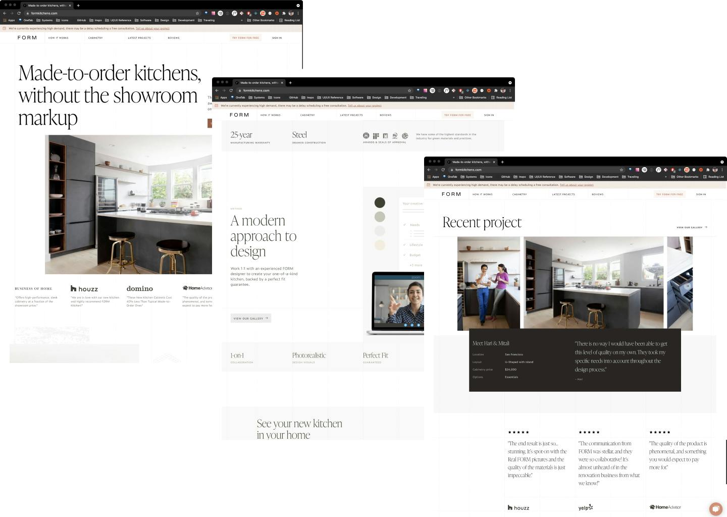
The homepage was the primary exploration vessel as I worked on developing the brand identity, creating & refining the selling points of FORM. At first I focused on creating the write sections which highlighted the most valuable aspects of FORM. I then explored the right aesthetic which balanced the copy and imagery and anchored it all with stats about the product or experience.
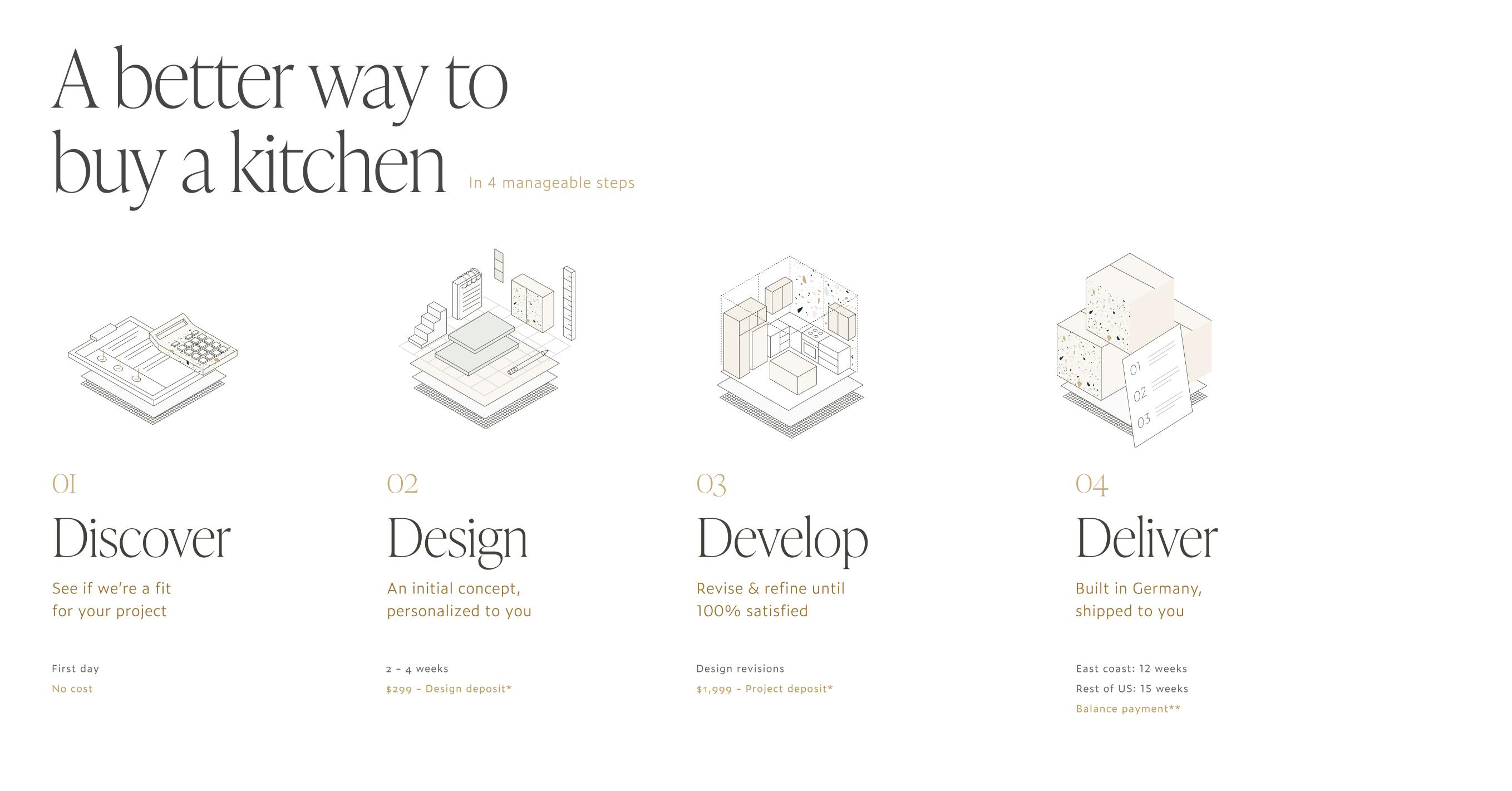
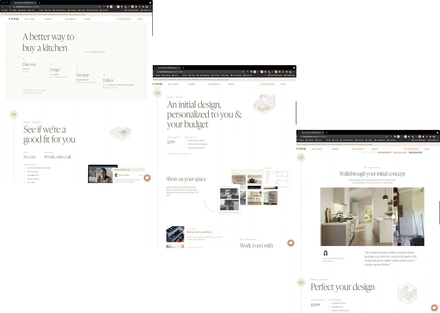
Besides the homepage, the How It Works took the most time. There were a few challenges. As highlighted earlier, FORM is offering a fundamentally new way of renovating the kitchen. Trying to explain this on a marketing page is no small feat. Plus, the founder wanted this page to not only be for site visitors, but as a tool for the internal team when discussing the process with clients. I wanted to separate those two jobs into different deliverables, but given the mentioned constraints we decided to achieve them in this one page.
I worked very closely with the founder, Danny, as I designed this page. He and I worked on refining the story and then broke it into four different phases. These phases were then built out into sections that balanced copy & imagery to provide the right level of context. As we designed the page Danny would use it while talking to potential clients. And so, we continued going back and forth until we felt the page was hitting all the right marks.
The next step for FORM is to create a video that follows the same structure as this page.
Continuing through the rest of the site
Development
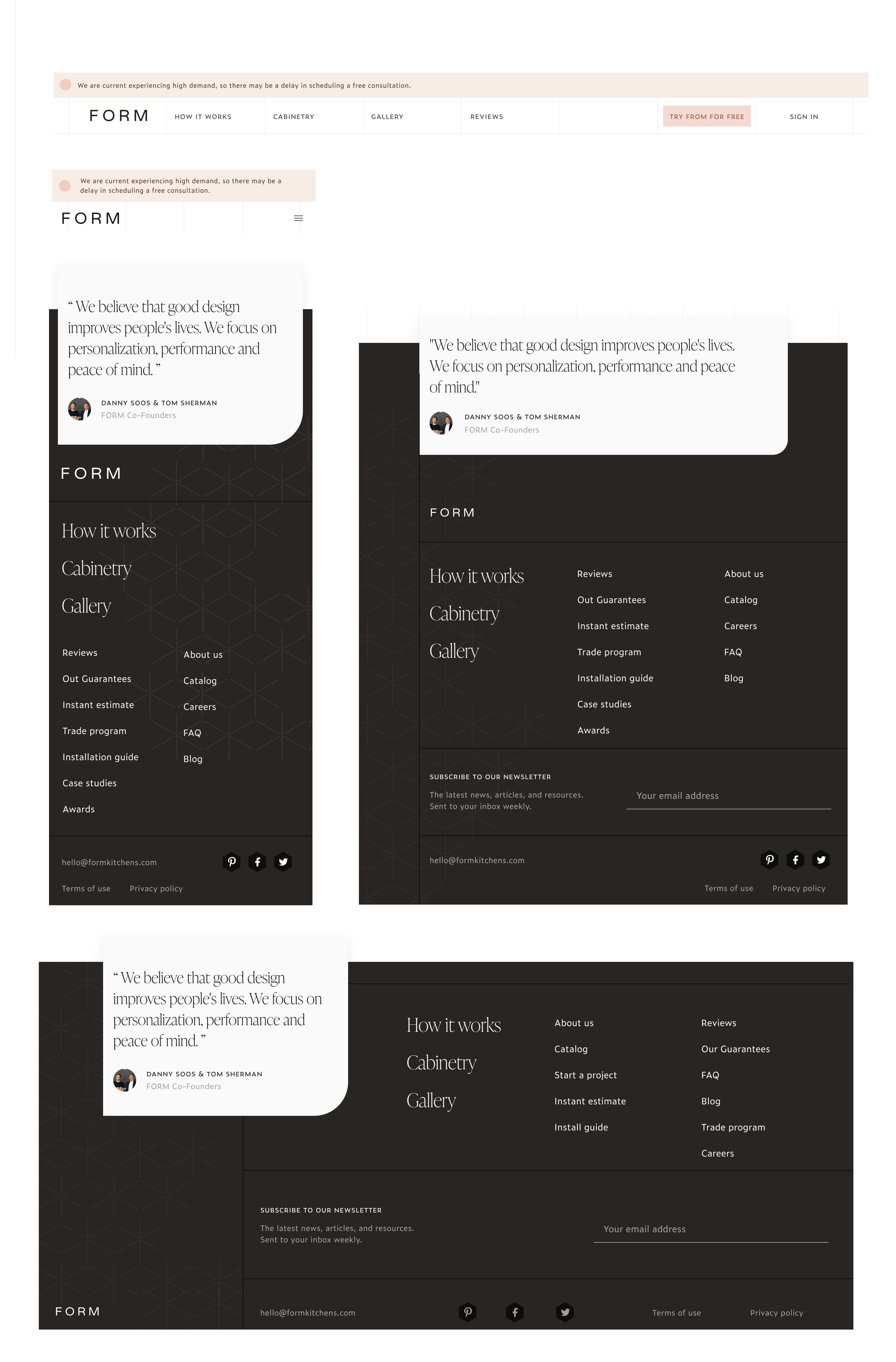
The development was the last phase and took roughly a month. First, I setup the foundational styling in tailwind, created the right content models in Contentful, and modified the Gatsby config to account for the new pages and additional tooling I was bringing into the system. I then tackled the repeating components like the navigation and the footer. Then I broke apart each page into its patterns and began developing those. I eventually ran into a number of one-off sections and styles which tends to happen on marketing pages. This was especially so on the how it works since it was unique in its storytelling structure.
Throughout the development phase I continued meeting with the team and talking through the implementation. While I tried to limit any major changes at this point, we did make quite a few adjustments throughout the website. Which I think is a healthy thing to do as you build out the pages and get to see them in actuality.
I did my best to set it all up so that the FORM team can continue making changes, most which will occur with the content now living within Contentful.
Recap
We ended up releasing the updated marketing pages a couple weeks late. However, given the small team and amount of effort the team as a whole was pleased at the results. Since the launch I've helped create a few more pages and ran a few workshops for the team so that they can continue modifying the existing pages & content as well as create new assets.


